The Elements Of The Mobile User Experience

The relevance of these elements will change depending on the type of device (feature phone versus smartphone versus tablet) and the presentation interface (app versus Web). This article briefly describes each of these elements and elaborates on each with selected guidelines.
Functionality
This has to do with tools and features that enable users to complete tasks and achieve their goals.
Guidelines

- Prioritize and present core features from other channels that have especial relevance in a mobile environment. For an airline, this includes flight statuses and flight check-ins. For cosmetic chain Sephora, it includes supporting in-store shopping via easy access to product reviews on mobile devices.
- Offer relevant mobile-only functionality (like barcode scanning and image recognition), and enhance functionality using the capabilities of mobile devices where possible to engage and delight users. Old Navy’s app serves up surprise games or savings when users snap the logo in a store.
- Ensure that fundamental features and content are optimized for mobile. For example, make sure the store locator shows the nearest stores based on the device’s location, and make the phone numbers click-to-call.
- Include features that are relevant to the business category. For retail websites and apps, this would include product search, order status and shopping cart.
- Offer key capabilities across all channels. Users who sign in should see their personalized settings, irrespective of the device or channel being used. If certain functionality is not offered on mobile, then direct users to the appropriate channel, as TripIt does to set up a personal network.
Additional Reading
- “Sharing App Bump 3.0 Slashes Most Features, Proves Less Really Can Be More,” Fast Company
Information Architecture
This has to do with arranging the functionality and content into a logical structure to help users find information and complete tasks. This includes navigation, search and labeling.
Guidelines

- Present links to the main features and content on the landing page, prioritized according to the user’s needs. Mobile Design Pattern Gallery has examples of primary and secondary navigation patterns for mobile, many of which are vertical instead of horizontal as on desktop websites.
- Enable mobile users to navigate to the most important content and functionality in as few taps or key presses as possible. Navigation optimized for small screens is usually broad and shallow instead of deep. While three clicks (or taps) is not the magic number, users need to be able to recognize that each tap is helping them complete their task. Every additional level also means more taps, more waiting for a page to load and more bandwidth consumed.
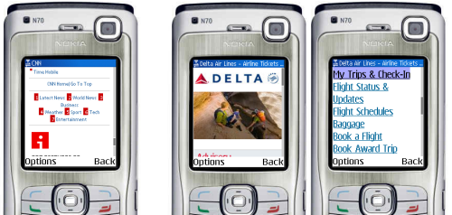
- Address the navigation needs of both touchscreen and non-touchscreen users. When designing for touch, make sure the tap size of the navigation item is at least 30 pixels wide or tall. Provide keypad shortcuts for feature phones, so that users can enter, say, a number (0 to 9) to quickly access a link:
- Provide navigational cues to let users know where they are, how to get back and how to jump back to the start. Mobile breadcrumbs are often implemented by replacing the “Back” button with a label showing users the section or category that they came from. For mobile websites, use standard conventions, such as a home icon that links back to the start screen, especially when navigation is not repeated on every screen.
- Use concise, clear, consistent and descriptive labels for navigation items and links. While always a good practice, it becomes even more important on tiny mobile devices.
Additional Reading
- “Chapter 1: Navigation,” Mobile Design Pattern Gallery, Theresa Neil
Content
Otherwise known as “the stuff on your website” (as Lou Rosenfeld and Peter Morville refer to it in Information Architecture for the World Wide Web), content is the various types of material in different formats, such as text, images and video, that provide information to the user.
Guidelines

- Present an appropriate and balanced mix of content to users (product information, social content, instructional and support content, marketing content).
- Use multimedia when it supports the user’s tasks in a mobile context, adds value to the content or supports the goals of the website. Most of the time, multimedia content is best provided when the user is looking for distraction or entertainment (such as news or funny clips) or when it has instructional value (for example, how to use an app or new feature).
- Always give the user control over multimedia content by not auto-starting video or sound, by allowing the user to skip or stop multimedia content and by being mindful of the bandwidth it takes up.
- Ensure that content is mobile appropriate. Just as we had chunking guidelines when going from print to Web, copy should be written for shorter attention spans on mobile devices. Optimize images and media for the device; this means scaling down for smaller devices and making sure images are sharp enough for the new iPad.
- Ensure that primary content is presented in a format supported on the target device. Even now, websites such as Volkswagen’s ask iOS users to download Flash.
Additional Reading
- “Mobile Content: If in Doubt, Leave It Out,” Jakob Nielsen, Alertbox
- “Mobile Content Strategy Link-o-Rama 2011,” Karen McGrane
Design
This has to do with the visual presentation and interactive experience of mobile, including graphic design, branding and layout.
Guidelines
- Remember the sayings “Mobilize, don’t miniaturize” (popularized by Barbara Ballard) and “Don’t shrink, rethink” (of Nokia). Both make the point that mobile design should not just rehash the desktop design.
- Design for glanceability and quick scanning. Glanceability refers to how quickly and easily the visual design conveys information.
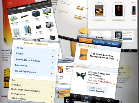
- Maintain visual consistency with other touchpoints and experiences (mobile, app, Web, print and real world) through the use of color, typography and personality. Identifying Amazon in the stack below is easy even though the brand name is not visible.

- Guide users from the initial and most prominent element of the design to other elements to help them complete their tasks. This is known as visual flow. A good design brings together visual elements as well as information architecture, content and functionality to convey the brand’s identity and guide the user.
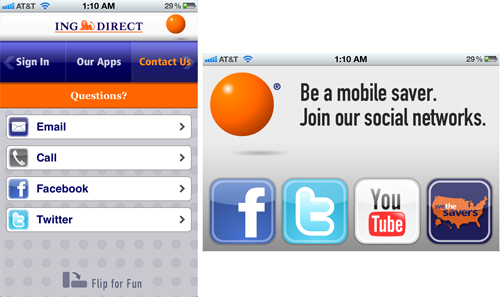
- Consider both portrait and landscape orientations in the design process. Devices increasingly support multiple orientations and automatically adjust to match their physical orientation. Maintain the user’s location on the page when they change orientation. Indicate additional or different functionality in the new orientation if applicable, as shown by ING:

Additional Reading
- “Designing Glanceable Peripheral Displays” (6 MB, PDF), Matthews, Forlizzi and Rohrbach, UC Berkeley
- Universal Principles of Design, Revised and Updated: 125 Ways to Enhance Usability, Influence Perception, Increase Appeal, Make Better Design Decisions, and Teach through Design, William Lidwell, Kritina Holden, Jill Butler
User Input
This has to do with the effort required to enter data, which should be minimized on mobile devices and not require the use of both hands.
Guidelines
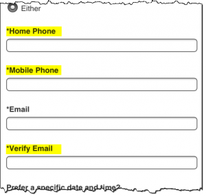
- Limit input to essential fields. Or, as Luke Wroblewski says in his book Mobile First, “When it comes to mobile forms, be brutally efficient and trim, trim, trim.” Limit registration forms to the minimum fields required, and use shorter alternatives where possible, such as a ZIP code instead of city and state. My favorite offender of this guideline is Volkswagen’s form to schedule a test drive; the mobile form has more required fields than the desktop version (the extra fields are highlighted below):

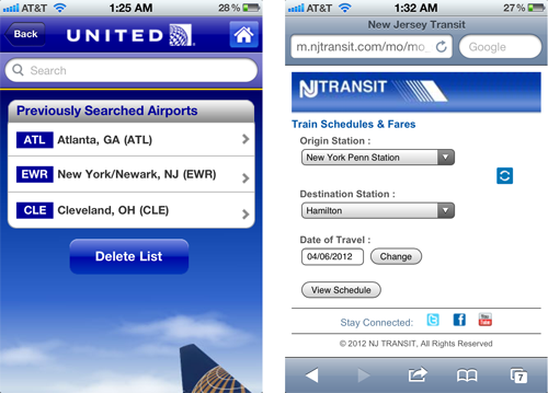
- Display default values wherever possible. This could be the last item selected by the user (such as an airport or train station) or the most frequently selected item (such as today’s date when checking a flight’s status):

- Offer alternate input mechanisms based on the device’s capabilities where possible. Apps take advantage of quite a few input mechanisms built into devices, including motion, camera, gyroscope and voice, but mobile websites are just starting to use some of these features, particularly geolocation.
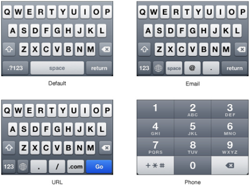
- Use the appropriate input mechanism and display the appropriate touch keyboard to save users from having to navigate their keyboard screens to enter data. Keep in mind that inputting data is more tedious on feature phones that have only a numeric keypad. For non-sensitive applications, allow users to stay signed in on their mobile device; and save information such as email address and user name because mobile phones tend to be personal devices, unlike tablets, which tend to be shared between multiple people.

- Consider offering auto-completion, spellcheck suggestions and prediction technology to reduce the effort required to input data and to reduce errors — with the ability to revert as needed. Disable features such as CAPTCHA where not appropriate.
Additional Reading
- “Forms on Mobile Devices: Modern Solutions,” Luke Wroblewski
Mobile Context
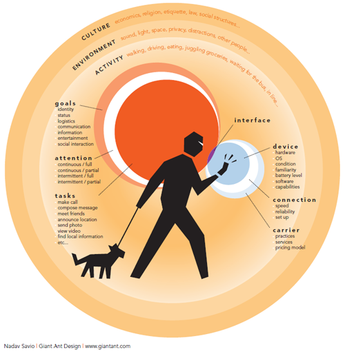
A mobile device can be used at anytime, anywhere. The mobile context is about the environment and circumstances of usage — anything that affects the interaction between the user and the interface, which is especially important for mobile because the context can change constantly and rapidly. While we often focus on distractions, multitasking, motion, low lighting conditions and poor connectivity, it also includes the other extreme — think using a tablet in a relaxed setting over a fast Wi-Fi connection.

Guidelines

- Use device features and capabilities to anticipate and support the user’s context of use. The iCookbook app allows users to walk through a recipe using voice commands — a nice feature when your hands are covered in batter!
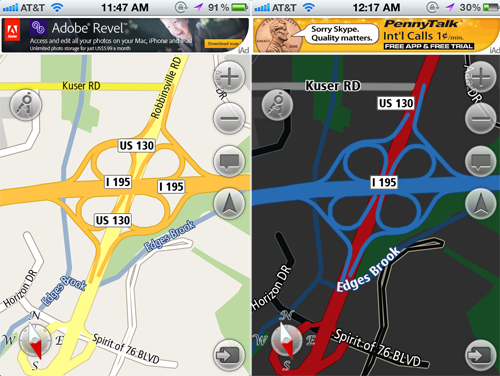
- Accommodate for changes in context based on the time of day and when the user is using the app. The Navfree GPS app automatically switches from day to night mode, showing low-glare maps for safer nighttime driving.
- Use location to identify where the user is and to display relevant nearby content and offers. A Google search for “movies” on a mobile device brings up movies playing nearby and that day’s showtimes, with links to buy tickets online if available.
- Leverage information that the user has provided, and respect their preferences and settings. After the first leg of a multi-leg flight, TripIt showed me the flight and gate information for my next flight, as well as how much time I had to kill. United’s app did no such thing, even though it knew much more about me. It could have shown me how to get from my current plane to the connecting flight and highlighted the location of the United Club along the way, where I could comfortably spend my two-hour wait, since it knew I was a member.
- Default to the user experience most appropriate for the device (i.e. a mobile experience for small screens, and perhaps a desktop-like experience for tablets), but give users the option to have enhanced features. A big discussion on how to present this to the user recently took place, with Jakob Nielsen recommending a separate mobile website and Josh Clark arguing instead for a responsive design; yet others believe that Nielsen and Clark are both wrong.
Additional Reading
- “The Context of Mobile Interaction” (0.2 MB, PDF), Nadav Savio and Jared Braiterman
- “On Mobile Context,” Jason Grigsby Don’t miss the links to resources on the mobile context near the end.
- “When and Where Are People Using Mobile Devices?,” Luke Wroblewski
Usability
This is the overall measure of how well the information architecture, design, content and other elements work together to enable users to accomplish their goals.
Guidelines

- Make it clear to the user what can be selected, tapped or swiped (this is known as affordance), especially on touchscreen devices. One of the big findings of Nielsen Norman Group’s usability studies of the iPad was that users didn’t know what was touchable or tappable. Another issue was swipe ambiguity: when the same swipe gesture means different things in different areas of a screen. Ensure that touchability is clear and that items such as links, icons and buttons are visibly tappable.
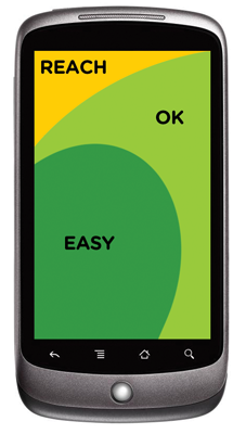
- For touchscreen devices, ensure that touch targets are appropriately sized and well spaced to avoid selection errors. Also, place touch targets in the appropriate screen zones; for example, put destructive actions such as those for deletion in the “Reach” zone, as shown by Luke Wroblewski in his book Mobile First:
- Follow conventions and patterns to reduce the learning curve for users and to make the mobile experience more intuitive. Dedicated apps should follow platform-specific standards and guidelines. A comprehensive collection of links to official UI and UX guidelines is available in the article “UI Guidelines for Mobile and Tablet Web App Design” on Breaking the Mobile Web.
- Ensure usability in variable conditions, including for daylight glare and changed angle of viewing and orientation, by paying attention to design elements like contrast, color, typography and font size.
- Do not rely on technology that is not universally supported by your audience’s devices, including Java, JavaScript, cookies, Flash, frames, pop-ups and auto-refreshing. When opening new windows or transitioning from an app to the browser, warn users to avoid overwriting already open tabs.
Additional Reading
- “Usability of iPad Apps and Websites,” Nielsen Norman Group
- “UI Guidelines for Mobile and Tablet Web App Design,” Max Firtman
- “Mobile Usability Update,” Jakob Nielsen, Alertbox
Trustworthiness
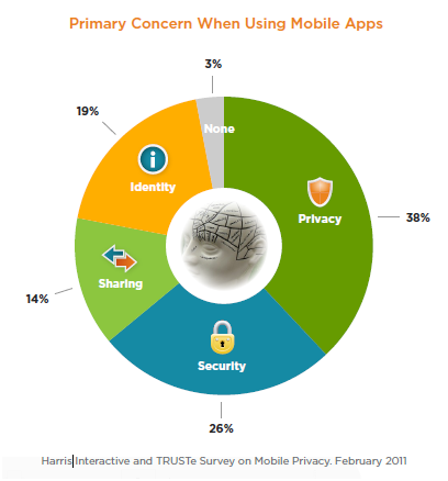
This relates to the level of confidence, trust and comfort that users feel when using a mobile website or app. According to a 2011 study by Truste and Harris Interactive, privacy and security are the top two concerns among smartphone users:

Guidelines
- Do not collect or use personal information (such as location and contact list) from mobile devices without the explicit permission of the user. The first few months of this year have seen numerous reports of apps secretly copying smartphone address books, with watchdogs up in arms and users retaliating.
- Make it easy for users to control how their personal information is shared in a mobile app by asking before collecting their location data and by allowing them to opt out of targeted advertising.
- Clearly state your business practices (including for privacy, security and returns), and present them contextually (such as by displaying links to your privacy and security policies on the registration screen). The policies themselves should be accessible in a secondary section of the mobile user experience (such as the footer or a “More” tab). Reinforce credibility by displaying trusted badges, especially when users need to trust you with their personal or financial information.
- Present policies appropriately on mobile devices by offering a concise summary and an option to email the entire policy. Privacy and security policies tend to be notoriously long and full of boring legalese that users often blindly click through to continue what they really want to do, so make it easy for users who are interested in the fine print.
- Don’t break the user’s workflow when displaying legalese. Take them back to where they were before being interrupted, instead of making them start all over.
Additional Reading
- “Layered Policy Design”, TRUSTe Blog
Feedback
This has to do with the methods for attracting the user’s attention and displaying important information.
Guidelines
- Minimize the number of alerts the app displays, and ensure that each alert offers critical information and useful choices. For a smile, look at Chris Crutchfield’s video on notification and alert overload.
- Keep alerts brief and clear, explaining what caused the alert and what the user can do, along with clearly labeled buttons.
- Notifications should be brief and informative, not interfere with anything the user is doing, and be easy to act on or dismiss.
- Provide feedback and confirmation on screen without disrupting the user’s workflow.
- If your app displays badges and status bar notifications, keep the badges updated and clear them only when the user has attended to the new information. Chase clears the notifications badge for its mobile app the moment the user visits the notification section, even before the user has seen which of their multiple accounts triggered the badge, forcing them to hunt through each account to see what triggered it.
Additional Reading
- “Mobile Notifications,” Fred Wilson
- “The Future of Mobile Notifications,” True Ventures
- “Chapter 8: Feedback and Affordance,” Mobile Design Pattern Gallery, Theresa Neil
Help
This relates to the options, products and services that are available to assist the user in using the website or app.
Guidelines
- Make it easy for users to access help and support options. Users commonly look for help in the footer of a mobile website and in the toolbar or tab bar of an app.
- Offer multiple ways to get support, including options relevant in a mobile context, such as self-serve FAQs, live support via click-to-call, and near-real-time Direct Message tweets. Two financial service companies that actively offer support via Twitter are American Express and Citibank.
- Present a quick introduction and short tutorial on using the app when it first launches, with options for the user to skip and view later.
- When introducing new or unique functionality (such as when check depositing via mobile apps was first introduced), offer contextual help and tips to guide users the first time, and as a refresher for infrequently used functionality.
- Offer help videos when appropriate, but allow the user to start, pause, stop and control the volume as they wish, and keep in mind the multimedia guidelines mentioned in the “Content” section above.
Additional Reading
- “ Chapter 7: Invitations ” and “Chapter 9: Help,” Mobile Design Pattern Gallery: UI Patters for Mobile Applications, Theresa Neil Chapter 7 is available online at UX Booth.
- “Top 6 Help Design Patterns for iPhone Apps,” Catriona Cornett, inspireUX
Social
This relates to content and features that create a sense of social participation, that enable user interaction and that facilitate sharing on established social networks.
Guidelines
- Create and maintain a presence on social networks (for example, a Facebook page) and local services (for example, a profile page on services such as Google Places, Bing Business Portal and Yahoo Local). These will be highlighted in search results and on location-based social networking services. In addition to your business’ name, include your physical address, phone number, URL and hours of operation.
- Incorporate your social presence and activity into your website’s mobile experience by showing your recent activity and offering an easy way to follow or like you on these networks.
- Integrate social networking features into your website’s mobile experience to make it easy for users to connect with their own social networks. This could be as simple as using APIs to enable social sharing, bookmarking, tagging, liking and commenting.
- Invite users to generate content featuring your brand, product or service from their mobile device, offering some incentive in return. For example, the burger chain Red Robin could invite the user to share a picture of their child reading a school book at one of its locations to get a free milkshake.
- Provide mobile offers that can be shared and go viral. American Express currently offers savings and discounts to users who sync their profiles on networks such as Facebook, Twitter and Foursquare to their credit card.
- Apps that rely on social contributions from users should look at ways to seed content in a way that is useful and, eventually, self-sustaining. For example, the My TSA app has a user-contributed feature that shows the wait times at security checkpoints, but it often shows outdated information, even though airport staff post physical signs of wait times at some airports.
Additional Reading
- “The Definitive Guide to Adding Social Features to Your Mobile Apps”, Verious
Marketing
This has to do with the methods by which a user finds a website or app and the factors that encourage repeated usage.
Guidelines

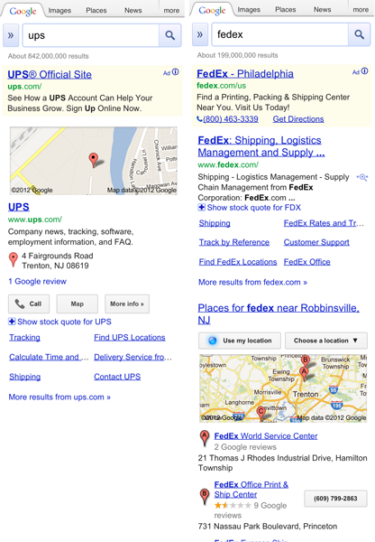
- Ensure findability by optimizing for mobile search and discovery, such as by keeping URLs short. If you have a separate mobile website, follow URL naming conventions ( m.site.com or mobile.site.com ). In mobile search results, provide quick access to location-based content (e.g. directions from one’s current location) and device-formatted options (e.g. click to call).
- “Quick response” (QR) codes should lead to a mobile-optimized landing page, instead of a traditional page that requires zooming or, worse still, to the website’s home page, from where the user has to hunt for information. As a side note, QR codes painted on buildings should be big and clear enough to be recognized and deciphered by mobile devices.
- Email campaigns should include a link to view the message in a mobile-friendly format, which itself links to the relevant offer page formatted for mobile — unlike CVS/pharmacy, which takes users to its mobile home page.
- Promote your app in other channels where possible (TV, print and in-store advertising), and offer incentives to download and use the app, usually in the form of discounts and savings. If your app has a price tag, attract users to buy it in an overcrowded market by offering a limited-time promotional price. Another option is to promote the app through the Free App A Day marketplace.
- Prompt users to rate and review your app or to share it on social networks after they have used it, but give them the option to postpone or stop these prompts. This will not only generate word of mouth, but give you insight into what users like and don’t like about the app. “Taking Control of Your Reviews” by smalltech discusses the strategy of encouraging happy customers to post reviews and unhappy customers to email you feedback.
Additional Reading
- “iPad App Marketing Case Study: Flickpad,” Chad Podoski, Mobile Orchard
- “The Art of Launching an App: A Case Study,” John Casey, Smashing Magazine
- “How to Market Your Mobile Application,” Michael Flarup, Smashing Magazine
Conclusion
Mobile user experience is still a developing field, and opportunities for improvement continue to emerge. We’ve presented an overview of the key elements of the mobile user experience, along with some guidelines to get started in each. Focusing on these individual elements will help us create great overall mobile user experiences for our users.


